Choosing the Art Behind Every Saving Abel Release
Artwork is the first handshake between a song and a listener, the visual cue that tells someone what kind of ride they are about to take. For Saving Abel, the cover we land on has to feel like the music feels, gritty where the guitars bite, warm where the chorus opens up, and honest in every shadow. We have spent years figuring out how to get that right, and the process has become as much a part of the recording cycle as the tracking sessions themselves. Every cover is a small film still from a story we have not finished telling yet.
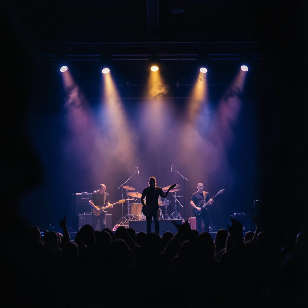
Across countless tours, from packed rooms in Sydney to outdoor stages in Adelaide, we have watched fans respond to certain sleeves before they ever heard a note. A great image pulls people in. A forgettable one makes them scroll past, no matter how strong the track underneath might be. That is why we treat the art selection like another instrument in the band, something that has to be tuned just right before we press go on a release.
When we set out to choose artwork for a new record or single, we start by asking what the songs are really saying once the microphones are off. Lyrics fade into the background of memory, but a striking image stays tattooed in someone's brain forever. We want our covers to live that kind of long life, the kind you spot on a tee at a brekkie cafe in Brisbane or as a sticker slapped on a pub wall in Perth.
The Australian road has shaped our visual instincts more than people realise. Triple J rotation, Soundwave posters, and ARIA week conversations all remind us that down here, music carries a different kind of grit. We lean into that when picking tones, palettes, and the small details that end up framing a single.
The Spark of an Idea
Every cover starts the same way, usually on a long drive between shows. Someone plays a demo in the van, and a phrase sticks. It might be a line about headlights on a country road, or a photograph one of us snapped on a servo stop somewhere out past Mildura. We write those moments down in a shared notes folder, and over the course of writing an album, the folder fills with textures we want to chase.
Sometimes the spark is a colour. A bleach-bright sky over Coffs Harbour, the rust red of the dirt around Alice Springs, or the moody blues of a Melbourne laneway at 2am. Other times it is a face, a feeling, a single object that holds the whole emotional weight of the record. We do not force it. We let the idea arrive like a mate turning up to the pub with no plan, and we roll with whatever shows up.
Mood Boards and Visual References
Once we have a direction, we build mood boards. Pinterest boards, ripped magazine pages, polaroids from the merch table at The Triffid, and screenshots from late-night cinema sessions all end up piled together. The board usually outgrows the song within a week, which is exactly the point. We want options.
Designers we have worked with over the years know the drill. We send over the music, the lyric sheet, and the board, then get out of their way. A good brief is short on words and long on feeling. We might say "rain on hot concrete" or "Sunday arvo at the laundromat" and let them run with it.
Collaborating With Designers and Photographers
Picking the right artist matters more than picking the right software. We have worked with illustrators who draw like tattoo artists and photographers who shoot like punk zine editors from the Sydney CBD. Chemistry shows up in the first round of sketches. If the early comps make us stop scrolling, we know we are onto something.
Communication during this phase is constant. Group texts at weird hours, shared folders, and the occasional late-night call from a tour bus parked outside a venue in Fortitude Valley. We try to give honest feedback without flattening the artist's voice. The goal is collaboration, not a committee.
Translating Songs Into Imagery
A great song cover is a translation, not a copy. We never want a literal scene from the lyrics staring back at the listener. Instead, we want the emotional temperature of the track distilled into a single image. A ballad might land as a quiet portrait. An anthem might come out as a wide landscape shot, like the kind you see on a Big Day Out poster from a decade ago.
We also think about how the artwork will look shrunk down to a streaming thumbnail, blown up on a back patch sewn onto a leather jacket, or printed on a stubby holder at the merch booth. If it survives all those scales, it has done its job.
Getting Feedback From the Road
Before we commit to a final version, we test it live. We drop a mockup onto a screen behind the drum kit during soundcheck at a venue like The Metro or 170 Russell, and we watch how the crew reacts without telling them what they are looking at. If they glance up, ask a question, or pull out their phone, we have something. If they keep tuning their guitars, we are not done yet.
We also pay attention to fan reactions at meet-and-greets and on the socials after a teaser goes out. The honest first response from people who have ridden with us for years matters more than any focus group.
Comparing Our Visual Approaches Over the Years
| Release Type | Typical Mood | Common Visual Cues | Best Suited For |
|---|---|---|---|
| Full-length album | Deep, narrative, cohesive story across multiple covers | Wide landscapes, recurring characters, muted palettes | Establishing a longer artistic era |
| Standalone single | Punchy, immediate, one clear emotion | High contrast, single focal point, bold typography | Quick attention on streaming feeds |
| Acoustic reissue | Warm, stripped-back, intimate | Natural light, grainy film stock | Reaching a more reflective audience |
| Anniversary edition | Retro, celebratory, nod to the original | Archival photos, vintage typography | Rewarding long-time listeners |
Visual Elements We Gravitate Toward
- Sun-bleached horizons shot on 35mm film
- Gritty urban textures from Melbourne backstreets
- Hand-set type that feels like a spray-painted stencil
- Single human silhouettes framed against wide skies
What We Want the Artwork to Say
- This band has been around long enough to mean something
- The songs inside are worth your evening
- The cover belongs on your wall, not just your playlist
- We are still hungry, still moving forward
Head over to the merch store and grab the new release in your preferred format, from vinyl to limited-edition tees featuring the latest sleeve. Sign up for the mailing list so you see the next cover drop before anyone else, and check the tour page for the next run of Australian dates. We will see you down the front.