The evolution of Saving Abel’s logo and branding
Saving Abel’s visual identity has developed alongside the band’s Southern rock sound, live energy, and changing place in the modern music landscape. Its logo and related artwork have helped connect hard-rock attitude with a recognizable, accessible image that works across album covers, posters, merchandise, and digital channels.
Branding for a touring rock group must do more than identify the musicians. It needs to remain legible from a concert venue wall, memorable on a shirt, and flexible enough for social media graphics. Saving Abel’s presentation reflects that practical balance, keeping a rugged edge while allowing room for new music, current members, and fan-focused updates.
A visual identity built for rock
The band’s name carries a strong biblical and literary association, giving the brand an immediate sense of drama. That weight is often reinforced through bold lettering, high-contrast layouts, and imagery that feels weathered rather than polished. The result suits a group known for emotionally direct songs and a powerful stage presence.
Early hard-rock branding commonly relied on heavy type, dark backgrounds, distressed textures, and limited color palettes. Saving Abel’s visual language fits within that tradition without needing excessive decoration. The name itself does much of the work, making a clear wordmark especially valuable for recognition.
From raw attitude to flexible presentation
As a band’s career progresses, its logo usually has to function in more places than it did at launch. A design that first appeared on physical releases may later need to work as a small profile image, a tour announcement, a backdrop, or a merchandise print. This encourages cleaner spacing and stronger outlines while preserving the original character.
Saving Abel’s branding can therefore be understood as an evolution in application as much as a complete redesign. The core identity remains associated with rock authenticity, while surrounding graphics can change with each release, tour cycle, or promotional campaign. This approach gives the band continuity without making every announcement look identical.
Typography, color, and atmosphere
Lettering is central to the band’s recognition. Heavy display fonts communicate volume and confidence, while roughened edges or compressed forms suggest movement and intensity. These choices make the logo feel connected to amplifiers, venue posters, and album artwork rather than corporate branding.
Black, white, red, metallic tones, and muted photographic colors are natural companions for this type of identity. They create visual contrast and reproduce effectively on shirts, stickers, banners, and online graphics. When brighter colors appear, they can signal a specific release or event without replacing the established rock aesthetic.
| Branding element | Earlier hard-rock emphasis | More flexible modern use |
|---|---|---|
| Wordmark | Large, forceful lettering | Clear scaling for mobile and merchandise |
| Color palette | Dark tones and strong contrast | Controlled accents for campaigns and tours |
| Texture | Distressed, gritty surfaces | Selective texture paired with cleaner layouts |
| Photography | Performance intensity and attitude | Wider focus on members, fans, and events |
| Logo placement | Album covers and posters | Social profiles, videos, store pages, and live media |
Branding that supports the live show
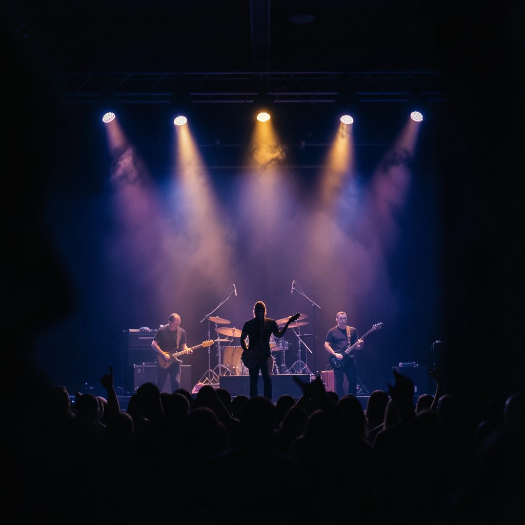
A logo becomes most convincing when audiences see it repeatedly in real-world settings. Stage screens, tour posters, event photos, and performers’ apparel turn a graphic mark into part of the concert experience. Repetition across these touchpoints helps fans connect the visual identity with the sound and atmosphere of a Saving Abel performance.
The band’s own account of preparation also shows why consistent branding matters. From rehearsing to loading in and stepping onstage, show-day preparation gives fans a closer view of the work behind the image. That human perspective complements the harder-edged logo by showing the people and effort represented by it.
A bridge between music and merchandise
Merchandise is one of the clearest tests of a band logo. A successful mark must look compelling on a black tee, remain readable on a small patch, and retain its personality when printed in one color. Saving Abel’s branding lends itself to these formats because strong typography can carry the design even when supporting artwork is minimal.
The online store and social channels also extend the identity beyond a single record cycle. Fans may encounter the band through a shirt, a tour announcement, a live photograph, or a recording update. Keeping recognizable lettering and a familiar visual mood across those formats makes each contact feel part of the same musical world.
Recommendations for reading the brand
- Compare logo treatments across album art, tour posters, and current digital announcements.
- Pay attention to how typography changes between large stage graphics and small social media icons.
- Look for recurring colors, textures, and photographic themes in official merchandise.
- Consider how the visual identity reflects the band’s live sound and Southern rock character.
- Track new releases and performances to see which elements remain consistent over time.
Keep the identity in motion
Saving Abel’s logo and branding work because they connect memory with momentum. Familiar lettering and a gritty rock atmosphere recall the band’s established identity, while adaptable layouts leave room for new members, recordings, tours, and fan experiences. That balance allows the brand to age without appearing fixed in the past.
Visit Saving Abel’s official channels, explore the latest merchandise, and follow upcoming shows to see how the visual identity continues to develop in real time. Each performance, release, and piece of fan content adds another layer to the story behind the name.