Our new album’s cover art: the story and design process
An album cover has to carry a feeling before the first note reaches the listener. For our new record, we wanted the artwork to reflect the tension, energy, and forward motion inside the songs. It needed to feel unmistakably Saving Abel while opening the door to a new chapter.
The final image came together through conversations, rough sketches, photography, color studies, and plenty of debate. Every choice had a purpose, from the lighting and texture to the placement of the band name. The result is a visual identity built to stand beside the music rather than simply decorate it.
Where the idea began
The earliest concept grew from the emotional center of the album. These songs move between weight and release, personal reflection and full-volume rock, so the cover needed contrast. We kept returning to images that suggested movement, worn surfaces, and light breaking through darker spaces.
Instead of chasing a polished studio look, we focused on something grounded and tactile. The artwork had to feel lived-in, much like the stories behind the songs. That direction gave us a foundation for a cover that could connect with longtime listeners while signaling that the new material has its own character.
Building the visual language
Our design team explored several creative routes before we settled on the final approach. Some sketches were stripped down and graphic, while others leaned into layered photography and dramatic scenery. Comparing those ideas helped us identify the strongest elements: bold contrast, a restrained palette, and a sense of depth.
Color played a major role in shaping the mood. Darker tones create space around the central image, while brighter highlights draw attention to the details we want fans to discover. The typography follows the same principle, remaining clear at a distance but carrying enough texture to feel connected to the record’s atmosphere.
From sketch to final frame
Once the direction was approved, the process became a collaboration between musicians, photographers, designers, and the production team. We reviewed test images, adjusted the composition, and considered how the cover would appear across vinyl, CDs, digital platforms, posters, and social media.
Photography brought an important human element to the project. A carefully controlled frame can still feel spontaneous when the expression, posture, and lighting work together. We looked for an image with enough tension to hold attention without explaining every part of the album before it was heard.
| Creative element | Purpose in the artwork |
|---|---|
| High-contrast lighting | Creates drama and reflects the album’s emotional range |
| Textured surfaces | Adds a raw, lived-in rock atmosphere |
| Restrained color palette | Keeps the focus on mood and central imagery |
| Strong typography | Makes the title and band identity easy to recognize |
| Layered composition | Rewards closer viewing and repeated listening |
Details that reward a closer look
The cover includes subtle visual references to the recording process and the ideas running through the lyrics. Some are easy to notice immediately, while others reveal themselves through repeated viewing. We wanted fans to have room to form their own interpretations instead of presenting a single fixed meaning.
Small imperfections were intentional. Grain, shadow, and rough edges help the image retain a physical quality in an increasingly digital music environment. Those details also echo the album’s production, where live energy, human timing, and honest performances remain central.
How the artwork fits the record
The cover is designed as the front door to the album’s world. Its visual tension matches the way the tracklist moves between heavy guitar-driven moments and more open, reflective passages. Nothing is separate from the listening experience: the title treatment, imagery, and sequencing all support the same emotional arc.
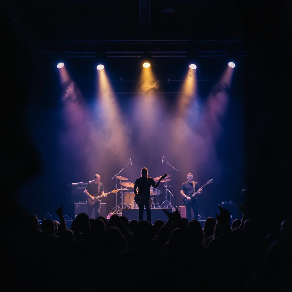
It will also become part of the wider release story through tour announcements, behind-the-scenes content, merchandise, and fan photography. As the campaign develops, we’ll share more of the creative process and show how the artwork translates across different formats. Fans can explore the band’s live photo gallery for a sense of the performance energy that helped shape this era.
What we wanted fans to feel
The finished cover should create a pause before the music begins. We hope it suggests scale, honesty, and motion without giving away every turn in the record. Like the songs themselves, it leaves space for listeners to bring their own memories and emotions into the experience.
When the artwork appears on a poster, a record sleeve, or a phone screen, it should still feel connected to the same story. That consistency matters because this album is more than a collection of tracks; it is a moment in the band’s ongoing creative life.
Ways to experience the new era
As the release gets closer, keep an eye out for:
- Behind-the-scenes images from the cover shoot and design sessions
- New merchandise featuring selected artwork elements
- Live performances where the album’s visual world comes to life
- Recording updates, release news, and additional project details
The cover is only the beginning of the album’s journey. Follow the latest band updates, watch for upcoming dates, and spend time with the artwork when the record arrives. Then turn it up, share the songs, and join us as this new chapter moves from the studio to the stage.